
(All opinions and statements are my own)
First I'll just give some background to the role graphics play here at ThomsonReuters. We publish to a number of different platforms and in a number of formats. Below are some examples.
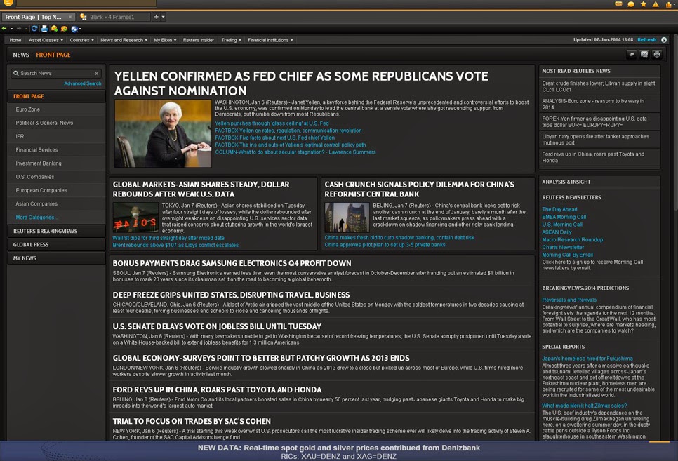
Thomson Reuters Eikon
Information graphics are used to accompany stories on ThomsonReuters Eikon, a platform delivering a powerful mix of news, analytics and financial content to desktop and mobile. Eikon has built in charting functions which allow the reader to view and analyse data on thousands of companies, indexes, commodities, currencies and more. See the short videos on charting and interactive mapping via the link here. Custom information graphics are also displayed with stories published through the news section of the platform.


Media clients
Reuters News Graphics Service (RNGS) is a subscription or pay-per-use infographic service for news publications. Available in English, Spanish, French and Arabic, the service has been trusted and used by news publications around the world for many years.
RNGS transmits around 5 to 15 graphics per day. Our goal is to produce quality graphics that use reliable data and charting, accurate mapping, clear diagrams and illustrations to cover a range of topics including breaking news, financial and company news, sports, environment, science, features and advance packages for major events.
Below are a few examples of different types of graphics we create. At present, all files transmitted to media clients are static, editable eps files (interactives to come in another post).
Breaking news
MH370
Even though it was a year ago, I couldn't touch on breaking news and not mention the missing Malaysia Airlines flight. This interactive is the easiest way to see what graphics we created during the disaster. All of the elements in here were also published to media as static maps and graphics as the news broke.

Daily charts
Here are some examples of the kind of charts we create on a daily basis. The graphic below shows the size of China's' Yuan swap lines with central banks.

This chart shows the extreme temperatures that caused play to be suspended in the Australian Open earlier this year.

Here are some more charts from the department.


Illustrated graphics
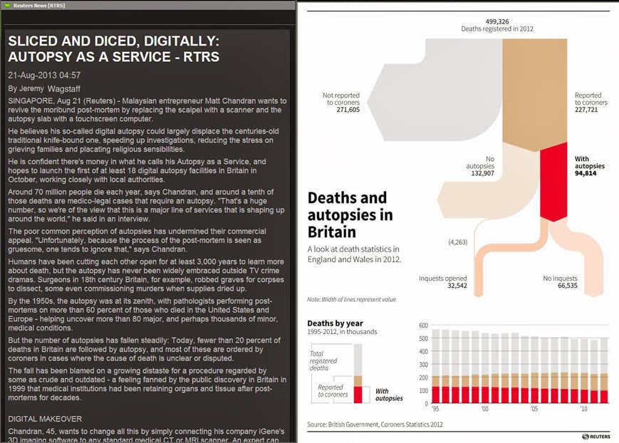
This Fukushima graphic accompanied an in-depth analysis on how the spent fuel will be removed from reactor no. 4.

The graphic below accompanied a story on GM's ignition switch recall.

Sports
This simple but effective chart showed how Tiger Woods regained top spot as golf's no. 1...
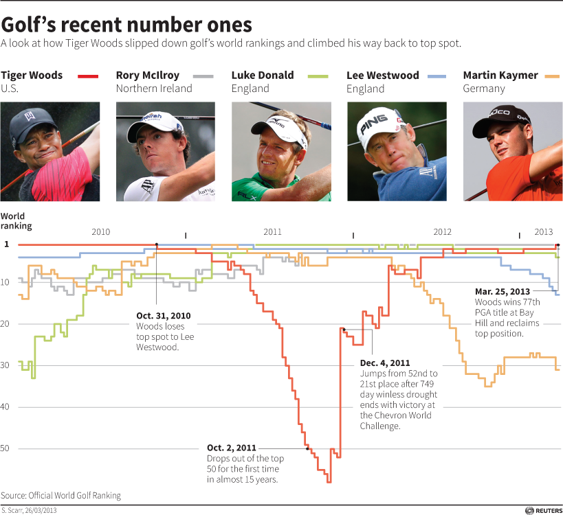
... and this is a similar interactive version we created afterwards.

We published the chart below when Gareth Bale broke the transfer record with a fee of 85 million pounds. We discovered that this was actually less than Ronaldo's fee in 2009 if adjusted for inflation.

We also issued a number of graphics before, during and after major events such as the Tour de France, World Cup and the Olympics but I'll come back to those in a later post.
Features and analysis
Sometimes we can provide background or analysis to an ongoing story such as the Israeli-palestinian conflict as shown below. The chart shows every documented fatality as a result of the conflict.

Sometimes we can provide background or analysis to an ongoing story such as the Israeli-palestinian conflict as shown below. The chart shows every documented fatality as a result of the conflict.

Expect some more posts on work from myself as well as work from the rest of the team at @reutersgraphics
No comments:
Post a Comment